
How to Choose Autumn Art You’ll Love All Year
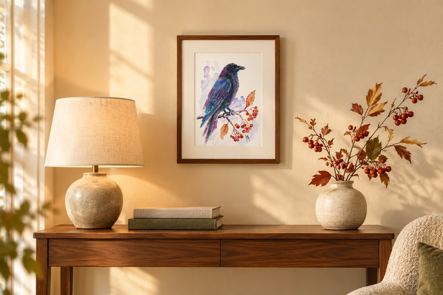
Autumn has a particular kind of beauty. The light lowers. Familiar fields turn gold. Birds become more noticeable against bare branches, and old barns seem to belong even more completely to the land around them.
It is natural to want some of that warmth inside our homes.
Yet autumn artwork does not need to disappear into a storage box when December arrives. A carefully chosen painting or print can feel especially lovely in October while still belonging in the room throughout the rest of the year.
The difference often comes down to what first drew you to the piece. If you love only its seasonal label, your interest may fade. If you connect with its color, subject or meaning, it has a much better chance of becoming part of your home.
Begin With the Feeling You Want in the Room
Before searching for fall wall art, decide how you want the room to feel.
Autumn can suggest many things:
Warmth
Reflection
Abundance
Change
Rest
Resilience
Homecoming
Quiet anticipation
Two autumn paintings may use similar colors yet create completely different experiences. A bright tree against a blue sky can feel lively and generous. A weathered barn beneath distant mountains may feel peaceful and grounded. A solitary bird can carry a note of courage or watchfulness.
Choose the feeling before you choose the obvious seasonal symbol.
That makes it easier to recognize artwork that belongs in your life rather than something purchased simply because the calendar says October.
Look for a Subject With Life Beyond the Season
Pumpkins, holiday phrases and harvest signs have their place, but they immediately announce a narrow time of year.
Nature offers subjects with a longer life.
A chickadee among red berries feels beautiful in autumn, but it can also bring color to a winter wall. A rabbit in dry grass may suggest fall at first glance, yet its quiet alertness has meaning in every season. Mountains, barns, branches and migrating birds carry stories that do not end when the leaves are gone.
My watercolor Autumn’s Messenger is connected to the season through its palette and natural details, but the subject speaks to something broader. Birds can suggest news, movement, change and the small encounters that make us pause.
That is the kind of seasonal connection I look for in my own work: present enough to be felt, but open enough to keep speaking.
Choose Autumn Color Rather Than an Autumn Theme
Color can bring the warmth of autumn into a room without making it look decorated for a holiday.
Classic autumn colors include:
Ochre
Amber
Burnt orange
Deep red
Plum
Moss green
Warm brown
Charcoal
Soft cream
You do not need all of them in one piece.
A painting that combines rust with blue may feel fresh and balanced. Gold beside violet creates richness without becoming rustic. Deep green can ground brighter reds and oranges. A pale sky or quiet area of cream gives the stronger colors room to breathe.
Look for one or two colors that already have a relationship with your room. They do not need to match your sofa or rug exactly. A small connection is usually enough.
Perhaps a copper-colored leaf echoes the wood of a table. A blue-gray mountain relates to the upholstery. A touch of red repeats the color of a book spine or ceramic bowl.
These subtle repetitions help the artwork feel settled rather than temporarily added.
Notice What Remains After You Remove the Word “Autumn”
Here is a useful test: describe the artwork without mentioning the season.
You might say:
A small bird holding its place among bright berries
A barn standing beneath a wide mountain sky
A quiet road disappearing between trees
Light moving across an open field
A rabbit listening at the edge of the grass
If the description still interests you, the work probably has enough substance to live beyond fall.
This is one reason I am drawn to painting weathered structures, wildlife and changing light. The season contributes to the mood, but it is not the entire meaning.
In a piece such as Weathered by Grace, the barn matters because it has endured. In Beneath a Resting Sky, the red cabin offers a feeling of shelter and stillness. Those ideas remain meaningful long after autumn decorations have been put away.
Consider How Much Seasonal Color Your Room Can Hold
A neutral room can carry a strong piece filled with orange, crimson or gold. In a room that already contains a great deal of color, a quieter autumn image may be easier to place.
Study the artwork’s overall balance.
Ask yourself:
Is one warm color dominant, or are several colors competing?
Does the piece include cooler colors for balance?
Are there quiet areas where the eye can rest?
Will the artwork disappear against the wall color?
Does it bring something the room currently lacks?
If your living room already contains brown leather, dark wood and warm lighting, another heavily brown image may feel too weighty. A fall landscape with open sky, pale grass or blue mountains could provide the needed contrast.
Conversely, a bright white room may benefit from an artwork with deep burgundy, ochre or charcoal.
Decide Between an Original and a Print
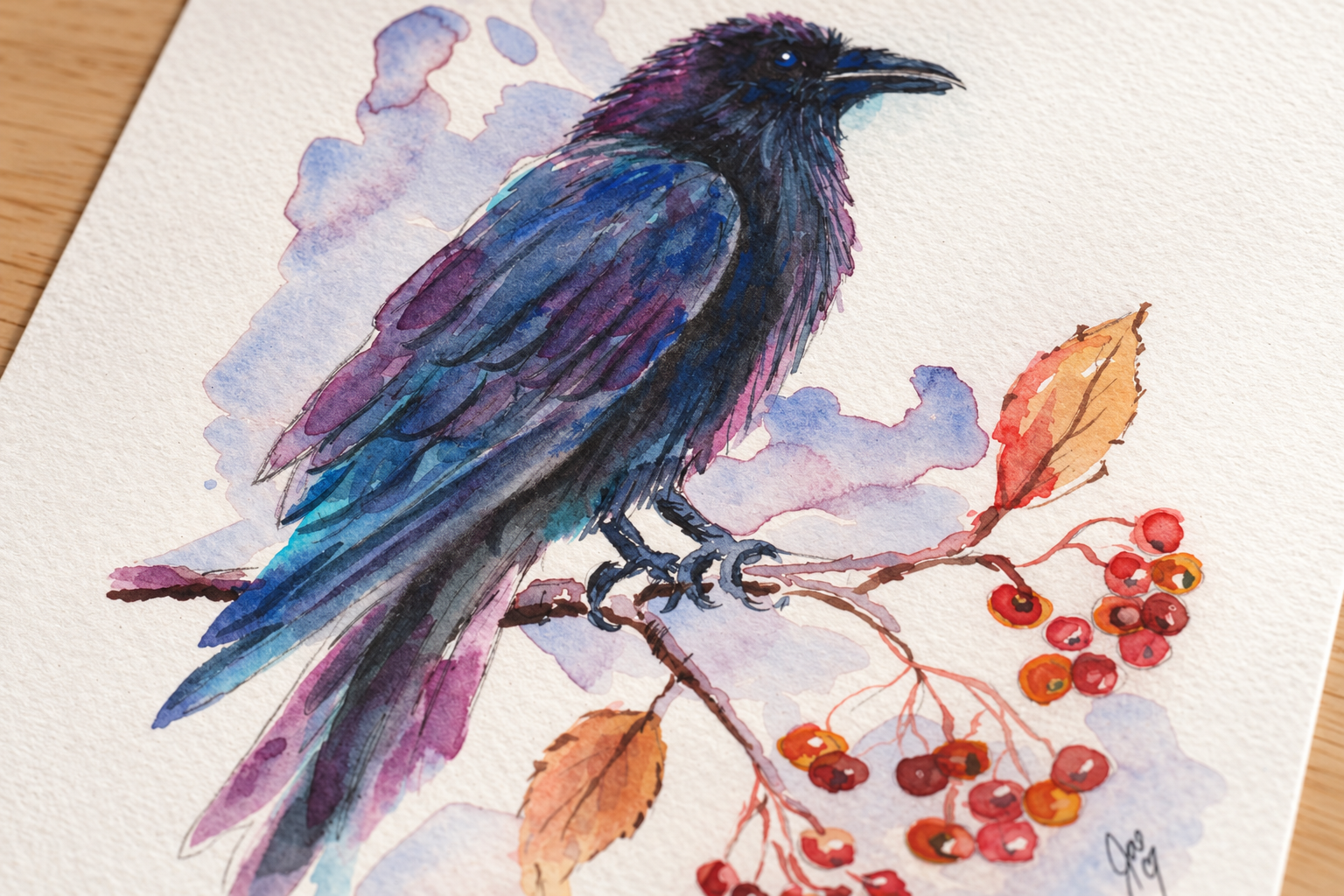
The choice depends on how you want to experience the work, where it will hang and what you value most.
An original painting
An original carries the artist’s physical marks. You can see variations in the surface, the edges of a wash, the pressure of a brush and small decisions that belong only to that piece.
Choose an original painting when you want a singular work with a direct connection to the artist’s hand.
A limited-edition print
A limited-edition print is produced in a fixed quantity and is usually signed and numbered. It can offer a sense of rarity while making a favorite image accessible in print form.
Check the listing for the edition size, paper, signature placement and included documentation.
An open-edition print
An open-edition print is not restricted to a predetermined quantity. It can be a flexible choice for a smaller space, gallery wall or thoughtful gift.
A well-produced print still allows the color, composition and meaning of the original artwork to become part of your home.
There is no single correct category. The right choice is the one that suits your space and creates the connection you want.
Use the Frame to Carry the Artwork Through the Year
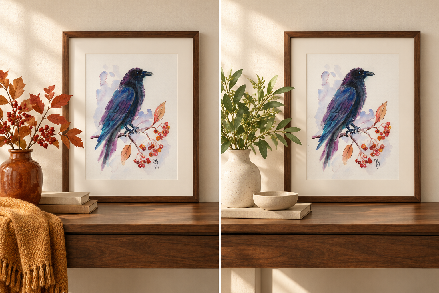
Framing has a strong effect on how seasonal art is perceived.
A heavily distressed brown frame may emphasize a rustic fall feeling. That may be perfect for your home, but it is not the only option.
For a more versatile presentation, consider:
Simple warm wood
Narrow black
Soft gold
Deep walnut with clean lines
Cream or white matting
A muted green or charcoal frame
A soft gold frame can draw out amber light while still feeling appropriate in spring. Black can make orange and red feel more contemporary. A light mat gives small watercolor prints enough space to feel calm and intentional.
If you like changing your artwork seasonally, use standard-sized frames with removable backs. The frame can remain in place while the art changes.
Let One Piece Set the Seasonal Note
A room does not need autumn imagery on every wall.
One painting or print can establish the feeling. Add a folded throw, a branch in a vase or a few books that repeat its colors. The artwork remains the focal point, and the supporting details can change as the months pass.
When winter arrives, remove the explicitly seasonal accessories and leave the artwork.
You may be surprised by how different it feels beside evergreen branches, winter light or a cream-colored blanket. In spring, pair it with fresh greenery or a pale ceramic vase.
Meaningful art adapts because the room around it changes.
Build a Small Nature-Inspired Grouping

Smaller prints can work beautifully as a pair or collected arrangement.
Instead of grouping only autumn scenes, look for a shared quality:
Similar light
Related colors
A repeated natural form
Rural subjects
Birds and botanical details
A sense of quiet
A connection to a particular place
Crimson and Feather, for example, could be paired with a quiet landscape or botanical watercolor. The subjects differ, but a shared red or warm neutral can connect them.
A barn print can sit beside an open landscape. A bird can be paired with branches, berries or a small mountain scene.
The grouping will feel personal rather than themed when the pieces share a mood instead of repeating the same subject.
Think About Where Your Eye Naturally Lands
Before choosing a size, stand in the room and notice where you look first.
An entryway may need one welcoming image. A reading corner can hold a smaller, quieter piece. The wall above a sofa usually requires more visual weight than a narrow hallway.
Use painter’s tape to outline the proposed size on the wall. Leave it there for a day. Look at it from the doorway and from the place where you normally sit.
For a small print, include the mat and outside frame dimensions in your taped outline. A modest image can have much more presence once it is properly framed.
Questions to Ask Before Buying Autumn Art
Pause before purchasing and ask:
Would I still be drawn to this subject if it were not labeled as fall art?
Does the artwork carry a feeling I want in my home?
Can I connect at least one of its colors to the room?
Does it include enough contrast for my wall?
Do I have an appropriate place to display it?
Would a different frame make it more versatile?
Do I want an original, limited edition or open edition?
Does the piece mean something to me beyond decoration?
If you can answer those questions with confidence, you are probably looking at something that will last.
Choose the Piece You Would Miss
The clearest test is simple: imagine the artwork removed from the room.
Would the space feel flatter without it? Would you miss the animal’s presence, the stretch of sky or the small note of color it brought to the wall?
That response matters more than a decorating rule.
Autumn reminds us that change can be beautiful, but the finest seasonal art does not need to leave when the season changes. It keeps offering warmth, memory and meaning whenever you stop to look.
Explore the current originals and nature-inspired prints at JaeBird Studio, including watercolor birds, rural landscapes and artwork shaped by the changing light.